📈 The Business Case for INP
We don’t just make sites faster for the sake of making them faster (as much as I would personally be cool with that anyway). We make them faster because by doing so, we make our sites more effective for businesses and provide a much better experience for users.
So it’s always nice to see folks sharing examples of how optimizing performance helped them out.
With Interaction to Next Paint supplanting First Input Delay in March as a vital, it’s natural that a lot of the focus will be on the search engine impact, but that’s not all we should be focusing on.
There’s a new case study from Trendyol talking about how a 50% reduction in INP (thanks to scheduler.yield) resulted in a 1% improvement on click-through rates from their listings pages to their product detail pages, per user session.
They won’t be alone.
Cliff Crocker wrote a post for the SpeedCurve blog exploring why INP is so much worse on mobile devices than desktop. There’s a lot of great info in the post, but one finding in particular stood out: it’s not just that INP is worse on mobile, but INP on mobile is much more strongly correlated with business metrics like conversion rates.
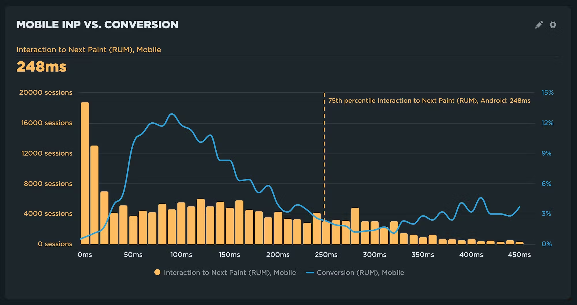
Now seems like a great time to start addressing your INP issues, if you haven’t started already.
🌍 How Did I Get Here?
The more you learn about how the internet works, the more you marvel that it ever works at all. There’s just a lot of plumbing, a lot of variability, and most of it is completely unseen and never thought of until something goes wrong.
That’s part of the reason why I really dig Lexi Mattick’s “How Did I Get Here?”—it brings a little visibility to what’s going on under the hood when you connect to a site, and it’s doing it in a way that’s both educational and engaging.
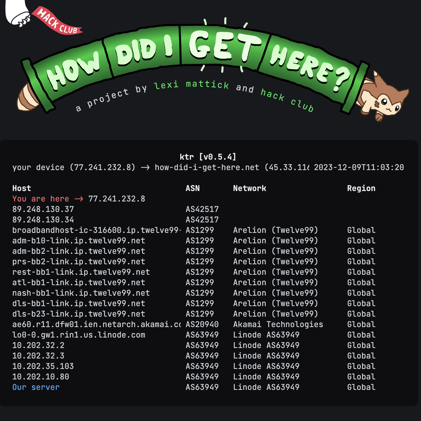
One of the first things I do in a lot of my “Getting Started with Performance” workshops is have folks run a traceroute so they can see all the many hops their packets have to make along the way to their destination. Lexi’s site makes that all visibile.
When you access her site, she runs a traceroute from her server to your computer and then outputs the results in reverse to help you see the journey your packets take (as she points out, it’s not 100% accurate, but for the sake of education, it’s close enough).
Then she uses the results of that traceroute and a mix of static and dynamic content to explain what is happening in a very approachable way.
It’s a wonderful side-project and a great educational resource.
🔐 Preconnect and CORS
The preconnect resource hint doesn’t get quite as much love and attention as the preload hint, which is a shame because it’s probably (he says without looking at any data) the more widely applicable of the two. It’s also a lot harder to shoot yourself in the foot with preconnect.
But you can still misuse it, as Harry Roberts does a great job of detailing in his latest. CORS (cross-origin resource sharing if you’re being technical, cross-origin ritual sacrifice if you’re using my preferred definition courtesy of Monica Dinculescu) seems to trip folks up on, well, pretty much everything and preconnect is no different. Harry walks through an example using the BBC’s site, but it’s one that likely applies for a lot of sites out there.
🐢 Please test on slow devices!
If you’ve seen any of my talks or read my post, you’re probably sick of me harping on how important it is to test on slower devices and slower networks. It’s a conversation I have often with my consulting clients as well. But if you want to broaden your reach, it’s absolutely essential.
Alex Russell has written some absolutely classic posts over the years on what he calls the “The Performance Inequality Gap”. One of the points he’s made, backed with serious data, is that your best bet for a test device is an Android device, a year or two old, around the $200 price point. Anything more powerful or newer is likely hiding issues.
The Wikimedia team basically made the same case in their Perf Calendar post. They’ve been using a little CPU Benchmark they created to help them measure the speed of their user’s devices. Plotting that out over different geographies is eye-opening. While the US had decent CPU speed, the long-tail of users in India (95th percentile) roughly matches a Moto G5—far from a powerful device.
Even more dramatic is South Africa. There, the 75th percentile roughly matches the Moto G5. In other words, they need a slower test device to represent 25% of South Africa traffic.
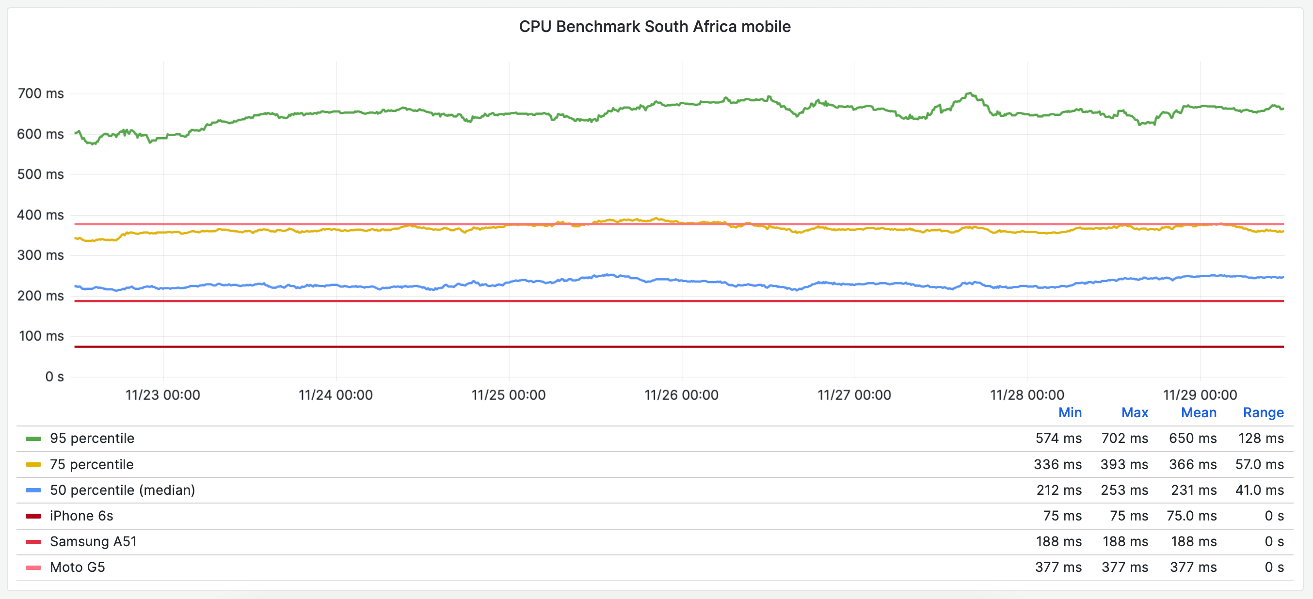
It’s a great post, and yet another great reminder that performance testing should focus on testing on slower devices as the default.